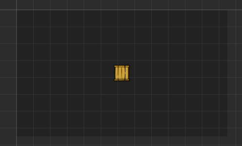
If you don’t want your game to be stretched or with black borders (on mobile devices), then you need to scale your game differently – by booting the game with dimensions of the device.
In this example we will place a box in the center of the map.
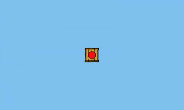
Then we change the background colour and add a ball sprite thorugh the source editor:
"use strict";
window.ScalingAdvanced.state.menu = {
    create: function() {
        this.game.stage.backgroundColor = '#7ec0ee'; //sets background colour
        mt.create("box_simple");
		//adding ball sprite
        var ball = this.game.add.image(mt.data.map.viewportWidth / 2, mt.data.map.viewportHeight / 2, '/ball.png');
		//manually changing the anchoring of the ball sprite
        ball.anchor.x = 0.5;
        ball.anchor.y = 0.5;
    },

    update: function() {

    }
};
The difference between the ball and box is that, even though both sprites are in the center of the game (for now), the balls placement is relative to the size of the viewport.
As for the actual scaling:
First we need to calculate the difference in aspect ratio and change the width or height of the game. This is done before booting up the game in ‘main.js’:
"use strict";
//global variables for screen size and margins (for centering)
var innerWidth = window.innerWidth || document.documentElement.clientWidth || document.body.clientWidth;
var innerHeight = window.innerHeight || document.documentElement.clientHeight || document.body.clientHeight;
window.marginTop = 0;
window.marginLeft = 0;

//calculates and changes the dimensions of the game according to the dimensions of users screen
var widthRatio = mt.data.map.viewportWidth / innerWidth;
var heightRatio = mt.data.map.viewportHeight / innerHeight;
if (widthRatio > heightRatio) {
mt.data.map.viewportHeight = widthRatio * innerHeight;
} else {
mt.data.map.viewportWidth = heightRatio * innerWidth;
}
window.marginTop = (innerHeight - mt.data.map.viewportHeight) / 2;
window.marginLeft = (innerWidth - mt.data.map.viewportWidth) / 2;

window.ScalingAdvanced = {

// reference to Phaser.Game instance
game: null,

// main function
main: function() {
//game boots up normally, except the width or height value has been changed
this.game = new Phaser.Game(mt.data.map.viewportWidth, mt.data.map.viewportHeight, Phaser.AUTO, document.body, window.ScalingAdvanced.state.boot);
},

// here we will store all states
state: {}
};

window.addEventListener('DOMContentLoaded', function() {
window.ScalingAdvanced.main();
}, false);
And then in ‘boot.js’ state we change the resizeGame function:
  var resizeGame = this._fitScreen = function() {

     //if viewed on a desktop device will center the game
     if (game.device.desktop) {
         document.body.style.maxWidth = mt.data.map.viewportWidth;
         document.body.style.maxHeight = mt.data.map.viewportHeight;
         document.body.style.margin = '0 auto';

         if (window.marginTop > 0) {

             document.body.style.marginTop = window.marginTop + 'px';
         }
         if (window.marginLeft > 0) {
             document.body.style.marginLeft = window.marginLeft + 'px';
         }

     }
     //if viewd on a handheld - will stretch the game
     else {
         game.scale.setMaximum();
         game.scale.setScreenSize();
     }

 };
This centers the game on desktop devices and minimally stretches it on handheld devices.
After scaling the positioning looks like this:
This allows the player to see more of the game world on devices with bigger screens, althought there are things like the HUD, which need to be positioned relatively to the game’s dimensions.
Full sample available here.


